Input widgets
Input widgets are specialized controls which can be presented to the user at any time, as part of the conversation. They are presented as alternative keyboards, meaning that the normal input control is hidden and the input widget is shown instead.
To see all input widgets in action and try them out, visit the Web client demonstration bot.
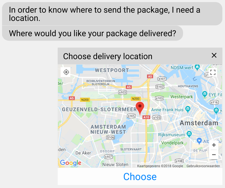
An an example, when your conversation needs to get a user's location, it is nice to present a specialized location picker widget for sending the location, which includes a map and the user's current position:
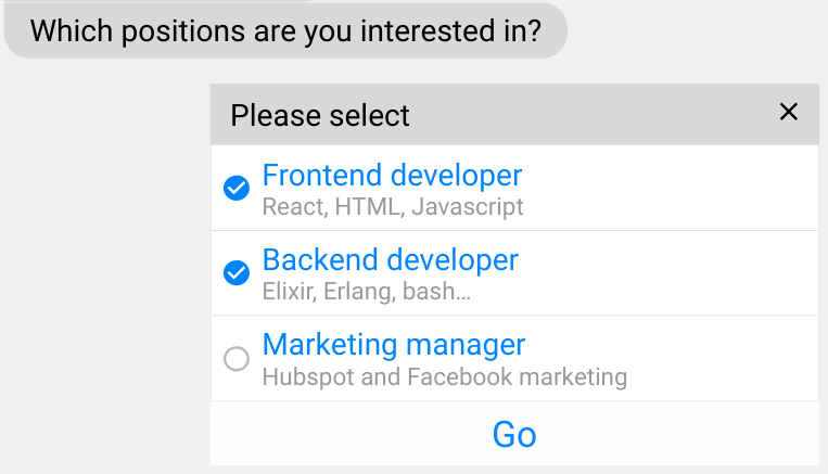
In another dialog, you might require the user to make a multiple-choice selection using checkboxes. You could use the item picker widget for this case.
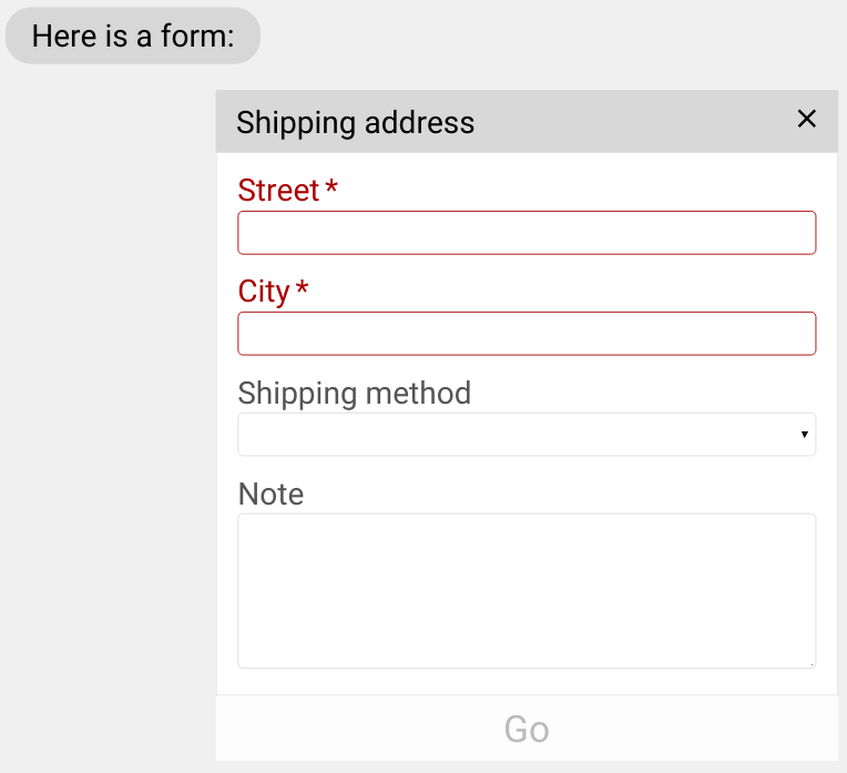
We also might want to present an entire form to the user at once. We can use the form input method for that, which looks like this:
Not all input widgets are supported on each platform that DialoX connects to. On platforms other than the web, the input widgets might not work. Refer to the channel-specific documentation to see which input widgets work on which channel.
Input widgets in Bubblescript
Input widgets are triggered by passing a special input method value to the
expecting: clause of the ask statement:
  choices = input_method("item_picker",
    caption: "Please select",
    mode: "multiple",
    items: [
      [title: "Frontend developer", subtitle: "React, HTML, Javascript", value: "frontend"],
      [title: "Backend developer", subtitle: "Elixir, Erlang, bash…", value: "backend"],
      [title: "Marketing manager", subtitle: "Hubspot and Facebook marketing", value: "marketing"]
    ])
  ask "Which positions are you interesed in?", expecting: choices
The choices variable here is filled using the input_method
function, which takes the input widget type as the first argument, and
the configuration of the widget as the second argument.
When the user submits the input widget, the user's selection is stored
in the answer.data variable.
Defining input widgets in data files
Instead of defining the widget in code like this, it is often easier to cleaner to create a YAML file and put the configuration in there:
  ask "Which positions are you interesed in?",
    expecting: input_method("item_picker", @item_picker)
Where the item_picker.yaml file contains:
caption: Please select
mode: multiple
items:
  - title: Frontend developer
    value: frontend
  - title: Backend developer
    value: backend
  - title: Marketing manager
    value: marketing
Input method reference
The function input_method(method, options) constructs a data
structure which triggers the showing of an input widget. It validates
the given options at runtime, to ensure that the widgets can be
presented in a sensible manner.
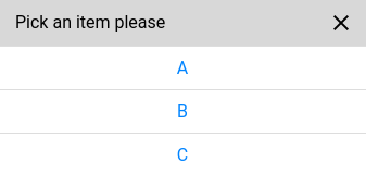
  # construct the item picker input widget
  choices = input_method("item_picker", items: ["A", "B", "C"])
  # feed it to 'ask'
  ask "Pick one item:", expecting: choices
The result of the input is stored in the answer.data variable. If
this variable is empty (nil), the user has cancelled the input
widget (by clicking the cross icon).
The currently supported input methods are "item_picker",
"location" and "form". The options to these are described below.
Common properties
All input widgets have some options shared between them:
required— Whether we require a value from the user or not. When the input is not required, a close button is shown in the top-right corner, allowing the user to cancel the interaction.default_value— The preset value for the widgetheight— A string, describing the desired height of the widget. Eithercompact,tallorfull. Defaults tocompact.caption— An optional caption which is displayed as a title bar on top of the widget.class— An optional CSS class which is set on the input widget. Can be used to tweak the styling for a particular widget.button_label— The label of the submit button below the control
Item picker
The item_picker input method is a versatile widget which can be used
in single and multiple selection mode.
Besides the common input widget options, it takes these extra options:
mode— eithersingleormultiple; defaults tosingle.confirm— In the case ofsingle, this is a boolean value which can be set totrueto show a confirmation button to confirm selection of the item. Otherwise, clicking the item immediately picks it.items— The array of items that the user can choose from. The list can be either a list of plain strings, or it can be a list of maps withvalue,titleelements (and optionally asubtitle).last_item— How the last item in amultipleitem picker behaves: either"default"or"exclusive". Iflast_item == "exclusive", it means that selecting the last item will unselect all other items, and selecting another item will unselect the last item.
Location selector
The location input method allows the user to pick a geographical location on
the map.
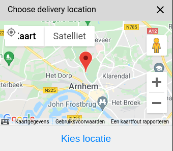
Besides the common input widget options, it takes these extra options:
center— lat/lng coordinate that sets the initial position on the mapzoom— the initial zoom level, a number between 1 and 20. defaults to 12.
When triggered, the location selector asks permission to retrieve the
user's location, and centers the map on that location. The center
option is only used as fallback when the user has denied this
permission.
Date picker
The date_picker input method is a widget which can be used
to let the user pick a single date.
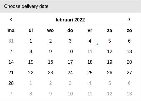
Besides the common input widget options, it takes these extra options:
confirm— A boolean value which can be set totrueto show a confirmation button to confirm selection of the date. Otherwise, clicking the date immediately picks it.-
constraints— An array of strings which specify the constraints of the date to be picked. At the moment, the following values are understood: -
only_future- only enable dates after today only_past- only enable dates before todayweekends- only enable saturdays and sundaysworkdays- only enable monday through friday
These constraints can be combined. For instance, you can have the user select
only workdays in the future by setting constraints to the array
["only_future", "workdays"].
Of course, some constraints do not make sense to combine (weekends + workdays for example.
Form
The form input method presents an entire form to the user inside the
conversation. This can be used to let the user answer multiple
questions at once, for instance, to ask somebody for his address
details.
Under the hood, this uses the React JSON Schema Form library. So most options described there are functional and usable in this input widget. The Form customization section especially, goes into detail on the available customization options.
The form input method takes the following options:
schema— The JSON schema that the form adheres to.ui_schema— Extra user interface options for the schema, see Form customization.
Form example
An example of a form input (as it is depicted in the image further up) is the following:
ask "Please enter your address", expecting: input_method("form", @address)
Where address.yaml contains:
caption: Shipping address
height: tall
schema:
  type: object
  properties:
    street:
      type: string
      title: Street
    city:
      type: string
      title: City
    method:
      type: string
      title: "Shipping method"
      enum: ["Airplane", "Boat"]
    comments:
      type: string
      title: "Note"
  required: ["street", "city"]
ui_schema:
  ui:order:
    - street
    - city
    - "*"
  comments:
    ui:widget: textarea
Phone number widget
In the form, a special UI widget can be used to add a phone number input:
@form %{
  caption: "Get phone number",
  height: "compact",
  schema: %{
    properties: %{
      phone: %{
        type: "string",
        title: "Phone number",
        # OPTIONAL: only accept dutch numbers
        pattern: "^\\+31[\\d]{9}$"
      },
    }
  },
  ui_schema: %{
    phone: %{
      "ui:widget": "phone_number"
    },
  }
}

dialog main do
  say "Fill out this form"
  await input_method("form", @form)
  say answer.data.phone
end
IBAN number widget
In the form, a special UI widget can be used to add a iban number input:
@form %{
  caption: "Get IBAN number",
  schema: %{
    properties: %{
      iban: %{
        type: "string",
        title: "IBAN account number"
      },
    }
  },
  ui_schema: %{
    iban: %{
      "ui:widget": "iban_number"
    },
  }
}

dialog main do
  say "Fill out this form"
  await input_method("form", @form)
  say answer.data.iban
end
Date picker form widget
In the form, a special UI widget can be used to let the user select a date:
@form %{
  caption: "Get date",
  schema: %{
    properties: %{
      date: %{
        type: "string",
        title: "Start date"
      },
    }
  },
  ui_schema: %{
    date: %{
      "ui:widget": "date_picker",
      "ui:options": %{
        constraints: ["only_future"]
      }
    },
  }
}

dialog main do
  say "Fill out this form"
  await input_method("form", @form)
  say answer.data.date
end
The constraints key in the widget's ui:options is the same as in the date
picker input method and allows you to place specific constraints
on the date that is to be picked.
Wait control
The wait control is a blocking interface widget which blocks the user from proceeding further. It can show a large spinner, to indicate that somethings is busy in the background and the user needs to wait.
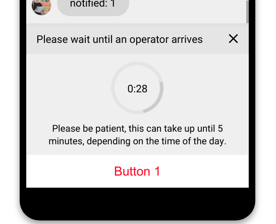
This control can be shown like this with the following code:
dialog please_wait do
  button = [
    title: "Button 1",
    type: "event",
    event: "button1"
  ]

  await input_method("wait",
    caption: "Please wait until an operator arrives",
    description: "Please be patient, this can take up to…",
    wait_time: 300,
    button: button
  )
end
This input method has the following options:
caption— the caption that is displayed on top of the input control.description— a longer text that can be displayed below the spinner.required— whether or not to display the "x" close button next to the header. Defaults totrue.wait_time- An optional number, the amount in seconds to wait. When given, it will display a countdown timer inside the spinner, like in the screenshow. If the countdown reaches zero, the dialog continues, with a timeout message being given as answer to the chat process. When givenwait_time: 0, no countdown will be shown and the control will be shown indefinitely. Whenwait_timeis omitted, no spinner is shown.button— an optional button that can be given, to show a large button below the control. The button can fire an event or can open a link, like normal buttons do.
Conversation closed control
This input control is similar to the wait control, except that it cannot be cancelled by the user. It will not show a spinner, but a checkmark instead.
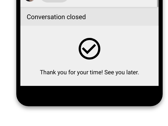
This control can be shown like this with the following code:
dialog closed do
  await input_method("closed",
    caption: "Conversation closed",
    description: "Thank you for your time! See you later."
  )
end
Its options are quite similar to the wait control:
caption— the caption that is displayed on top of the input control.description— a longer text that can be displayed below the checkmark.button— an optional button that can be given, to show a large button below the control. The button can fire an event or can open a link, like normal buttons do.show_qr— when there's a button withtype: "web_url", it will render this button as a QR code on desktop (and a regular button on mobile).
Numeric input
This input control shows an alternative keyboard with the numeric keypad.
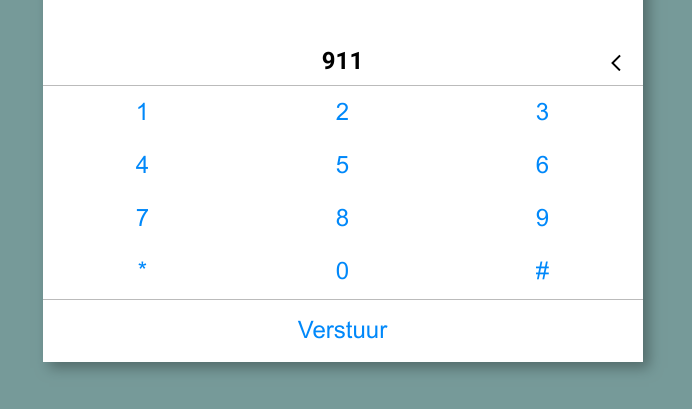
This control can be shown with the following code:
dialog main do
  ask "Enter up to 4 numbers:", expecting: input_method("numeric", num_digits: 4)
end
It works similarly to a regular numeric input. On the phone channel, this method can be used to capture a longer (>2) sequence of DTMF characters.
This input method has the following options:
caption— the caption that is displayed on top of the input control.required— whether or not to display the "x" close button next to the header. Defaults totrue.num_digits— controls the maximum number of digits that can be entered.finish_on_key— pressing this key will send the earlier entered numbers. For use in IVR scenario's, "Enter the number and press #".