Content management
Using data files we know how we can store data inside our bot, without touching our bot's code directly.
You might want to give less technically skilled people access to these files, in order for them to edit them and manage the content. However, there is the risk they break the bot by entering incorrect data, or destroying the entire file.
To address this, the DialoX platform allows developers to define a a
basic content management system (CMS). It is possible to invite users
into the studio, giving them just the editor access role. With this
role, they cannot see or edit a bot's code, and they also cannot edit
any data files directly.
The CMS lives in a dedicated menu entry called Content. It is composed of multiple parts, called Content sections. Each section has a descriptive title and an icon, to indicate its purpose.
Each content section represents either an editable form, or a spreadsheet.
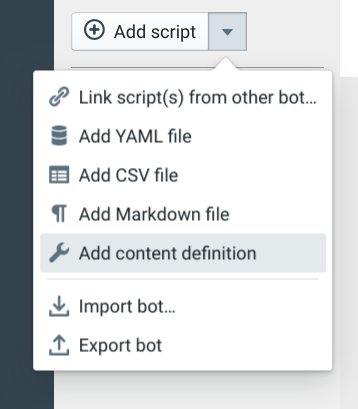
Defining content sections
When you have created your first content definition, a new content tab is enabled in the bot editor, showing the available content sections. It looks like this:
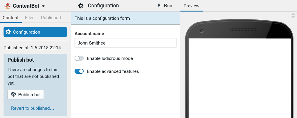
On the left side, there are the various content sections; in this case there is only one, named "Configuration". In the middle, it shows the actual configuration form. Any data you enter in this form, gets saved in a YAML file in the bot's scripts.
When you change the content, you can try it out directly in the bot by clicking the Run button.
The data edited in the CMS is versioned just like the rest of the publishing cycle of scripts. You'll notice that, as soon as you change any data, you'll see the publish box pop up. Click Publish to put the changes live, or revert to undo any changes to the data.
Form data
Every content section is represented by a single content definition file: a special YAML script which is part of your bot.
To create a content section like the one above, start by creating a Content definition YAML file in your bot:
Then, hit publish, and immediately the Content section becomes visible in the studio.
The content definition you added looks like the following:
# This is an example "Content Definition" YAML file.
# Files like these define sections of the bot's CMS. Each section
# creates either a form or a data table, which can be edited by users
# (editors) that do not have access to this bot's code.
#
# For more information about the CMS feature:
# http://developer.dialox.ai/customize/cms/
type: form # or 'table'

# Define where the content gets stored
storage:
  type: script # stored inside a script file
  script_title: config # Please create a YAML file with this title!

# title of the CMS section
title: Configuration

# see http://blueprintjs.com/docs/v2/#icons for possible icon names
icon: cog

# Optional extra description / help text
description: This is a configuration form

# The form definition, defines the data that can be edited
form:
  # the JSON schema, describing the form
  schema:
    type: object
    properties:
      account_name:
        type: string
        title: Account name
      is_advanced:
        type: boolean
        title: Enable advanced features
      is_ludicrous:
        type: boolean
        title: Enable ludicrous mode
  ui_schema:
    # specifies the ordering of the fields
    ui:order:
      - account_name
      - "*" # all the others
It is heavily commented and should be pretty much self explanatory. A
content definition like this defines a section in the CMS part of the
bot, with a title, an icon, a possible description, and the definition
of the actual form. The storage section defines where the content
should be stored. For now, content is always stored in a script, so
you need to make sure that there is a data script with the same name
as given in the storage.script_title key.
JSON Schema
The form.schema key is the most important key of the content
definition: the schema defines the shape of the content. For this, we
use JSON schema, which is a way to describe
how data looks. And in our case, it also describes how the form looks
that will be shown in the CMS.
For composing the form, we use the React JSON Schema Form library. So most options described there are functional and usable in the content definition. The Form customization section especially, goes into detail on the available customization options.
Specialized content widgets in forms
By using ui:widget in the UI schema, it is possible to use form
widgets that are specialized for editing a specific type of
content. The following are supported:
ui:widget: image- render an image pickerui:widget: file- render a file uploaderui:widget: location- render a location pickerui:widget: timezone- render a timezone pickerui:widget: integration_token- See "integration tokens" belowui:widget: intent_picker- render a selection box for picking an intent. Works in collaboration with the intents side panel.ui:widget: expression- a text input box mean for entering BubbleScript expressions. The input is validated to prevent invalid expressions from being entered.ui:widget: dynamic_enum- a combination of input box + select list with an automatic autocomplete on similar values entered in the form.ui:widget: blueprint_icon_picker: - a select box which lets you select an icon from the BlueprintJS icon set.ui:widget: radio: to render a boolean or enum field as radio buttons.ui:widget: phone_number: to render a phone number inputui:widget: phone_number_or_extension: to render a phone number input with extension chooserui:widget: markdown: a richtext textarea which stores its content as Markdown.ui:widget: password: a password field with a 'show' / 'hide' button
Integration tokens / secrets
It is possible to render an OAuth connect button or secrets entry control inside a form, to be able to configure a bot's OAuth connection to an integration provider from within a CMS form.
For this to work, you need to set up an integration with an OAuth
provider in the integrations.yaml file (See API / OAuth
integrations on how to set that up).
Specify integration_token as ui:widget, and add the alias to the
integration provider to the ui:options, like below:
google_token:
  ui:widget: integration_token
  ui:options:
    alias: google
In this example we assume that you have an integration configured under the alias "google".
When you have set all of this up, you will see a "Request Authorization" button rendered inline in the form, which triggers the start of the OAuth flow.
For the
provider: secret, this form control will render an input control plus a save button to commit the secret to the secrets store.
Translatable content
By using the ui:field: i18n option in the form's UI schema
definition, fields are marked as being translable.
form:
  # the JSON schema, describing the form
  schema:
    type: object
    properties:
      account_name:
        type: string
        title: Account name
  ui_schema:
    account_name:
      ui:field: i18n # mark the account_name as translatable
Next to each field that is translateable, a flag will appear like this:
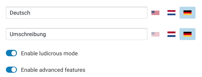
Language flags are semi-transparent when the corresponding string is still empty.
It is also possible to combine ui:widget with ui:field: i18n; so
in that way it is possible to create a multilingual location, file or
image picker.
Recording
For phone bots it can also be useful to record an audio rather than using text
to speech. For this you can use the speechmarkdown field:
ui_schema:
  ui:field: speechmarkdown
Automatic UUID
By using the ui:field: auto_uuid option in the form's UI schema
definition, you get a hidden field which is filled with a unique identifier.
form:
  # the JSON schema, describing the form
  schema:
    type: object
    properties:
      id:
        type: string
  ui_schema:
    id:
      ui:field: auto_uuid
Human ID
To generate a hidden identifier for a form item, you specify ui:field: human_id. Based on one of the other fields in the form, it will generate an
identifier which is Bubblescript-safe and human readable (as opposed to
auto_uuid). The generated identifier is lowercased, and has non-alphanumerics replaced by underscores.
form:
  schema:
    type: object
    properties:
      id:
        type: string
      label:
        type: string
  ui_schema:
    id:
      ui:field: human_id
      ui:options: { from_field: label }
An extra ui:options field is prefix, which you can set to a prefix that is always prepended to the generated id.
Radio widget
To enable a boolean or enum field to be rendered as radio buttons:
form:
  schema:
    type: object
    properties:
      cool:
        type: boolean
  ui_schema:
    cool:
      ui:widget: "radio"
      ui:options:
        inline: true
Flow picker widget
Select a Flow from a dropdown list and stores the ID of the flow in a string field.
form:
  schema:
    type: string
    title: "A flow"
  ui_schema:
    ui:widget: flow_picker
Intent picker widget
Select a Intent from a dropdown list and stores the ID of the intent in a string field.
form:
  schema:
    type: string
    title: "An intent"
  ui_schema:
    ui:widget: intent_picker
    ui:options: { intents_type: "local" }
Using the intents_type option you can optionally decide whether to only pick
global, local or all intents (leave the option empty in that
case).
whatsapp template picker
Select a Whatsapp template from a list of the currently connected Whatsapp channel or integration and stores the name of the template in a string field.
form:
  schema:
    type: string
    title: "Choose template"
  ui_schema:
    ui:widget: whatsapp_template_picker
Tag input control
To be able to easily edit a list of (short) string, you can use
ui:field: tag_input. This will render a Tag
Input
control instead of the default RSJF string array:
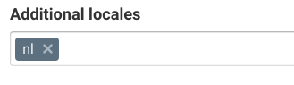
You would configure a string tokens input like this:
form:
  schema:
    type: array
    title: "Extra locales"
    items:
      type: string
  ui_schema:
    ui:field: tag_input
Tag picker control
The tags section in the bot settings allow you to define a taxonomy of frequently used tags in your bot. These tags are used on several places in the studio, for instance in the analytics section, the inboxes and the dashboard. They can also be used in the CMS to pick tag(s) from a predefined list of tags.
In multiple tags mode, the tag picker works on an array of strings:
form:
  schema:
    type: array
    title: "A list of tags"
    items:
      type: string
  ui_schema:
    ui:field: tag_picker
In single tag mode, the tag picker works on a single string:
form:
  schema:
    type: string
    title: "A tag"
  ui_schema:
    ui:field: tag_picker
Furthermore, to only allow picking from a specific group of tags (for instance, the inbox), configure the tag_group ui:option:
form:
  schema:
    type: string
    title: "Select an inbox"
  ui_schema:
    ui:field: tag_picker
    ui:options:
      tag_group: inbox
When tag_group is specified as an option, it is also possible to add
allow_create: true to be able to create tags on-the-fly from the CMS, directly
in the tag settings file:
form:
  schema:
    type: string
    title: "Select an inbox"
  ui_schema:
    ui:field: tag_picker
    ui:options:
      tag_group: inbox
      allow_create: true
To be able to type arbitrary tags and not be constrained to the defined tag taxonomies, use allow_arbitrary:
form:
  schema:
    type: string
    title: "Select an inbox"
  ui_schema:
    ui:field: tag_picker
    ui:options:
      allow_arbitrary: true
allow_arbitrarycannot be used in conjunction withallow_create; the latter takes precedence.
Flow condition control
Create a conditional expression for a Flow by selecting one or more tags and a condition type (all of, any of, none of):
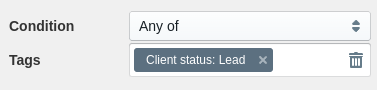
Under the hood, the data structure that is created is an array, that is why the
type needs to have the array annotation.
form:
  schema:
    type: array
    title: "Condition"
  ui_schema:
    ui:field: flow_condition
You can use the builtin flow_condition? function to check whether the current conversation matches against the given condition.
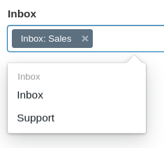
Channel picker control
Selects one or more channels (frontends) from a dropdown list and stores the ID of the channel in a string array field. Only channels that are currently configured in the bot are available for selection.
The YAML for a channel picker looks like this:
form:
  schema:
    type: array
    items:
      type: string
    title: "Choose channels"
  ui_schema:
    ui:field: frontend_picker
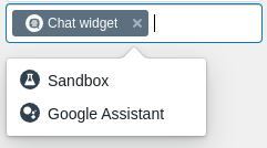
Bot picker control
Sometimes there is a need for creating links between bots in the CMS where the
user needs to select one or more bot IDs. For this use case, the
accessible_bots_picker field can be used, to select a single or an array of
bot IDs.
In multiple mode, the bot picker works on an array of stirngs:
form:
  schema:
    type: array
    title: "A list of bots"
    items:
      type: string
  ui_schema:
    ui:field: accessible_bots_picker
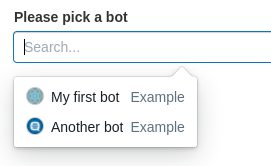
In single bot mode, the bots picker allows to select a single bot ID:
form:
  schema:
    type: string
    title: "Please pick a bot"
  ui_schema:
    ui:field: accessible_bots_picker
By default, all bots that are accessible to the current user are shown in the bot selection dropdown. To only show the bots within the current environment, pass the only_current option to the options:
form:
  schema:
    type: string
    title: "Please pick a bot"
  ui_schema:
    ui:field: accessible_bots_picker
    ui:options:
      only_current: true
Calendar(s) picker control
The Calendaring module lets you work with calendars of all sorts. To
have a CMS field to pick one or more calendars, specify a ui:field:
calendar_picker.
In multiple calendars mode, the calendar picker works on an array of strings:
form:
schema:
type: array
title: "A list of calendars"
items:
type: string
ui_schema:
ui:field:
calendar_picker
In single calendar mode, the calendar picker works on a single string:
form:
  schema:
    type: string
    title: "A calendar"
  ui_schema:
    ui:field: calendar_picker
Calenders can be filtered by the following options:
- cms_only
- has_slots_cms
Example:
form:
  schema:
    type: string
    title: "A calendar"
  ui_schema:
    ui:field: calendar_picker
    ui:options:
      cms_only: true
      has_slots_cms: true
cms_only
The calendar picker can be filtered on wether there is a CMS defined on the calendar.
| value | description |
|---|---|
| true | all calendars that are defined in the integrations.yaml as cms_only: true |
| false | all calendars that are defined in the integrations.yaml as cms_only: false |
| null | all calenders |
has_slots_cms
The calendar picker can be filtered on whether there is a slots CMS defined.
| value | description |
|---|---|
| true | all calendars with a cms type: calendar_slots |
| false | all calendars without a cms type: calendar_slots |
| null | all calenders |
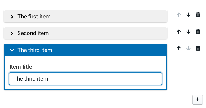
Collapsible lists
Managing large lists in the CMS can become quite cumbersome, as each
form takes up a lot of space. To circumvent this, it is possible to
collapse each item in the array, to make more space and hide the
details of each item. This is done using ui:field: collapsible_array, incombination with a CSS class. Once configured,
this will look like this:
A minimal JSON UI schema configuration for collapsible lists looks like this:
form:
  schema:
    type: array
    items:
      type: object
      properties:
        title:
          type: string
          title: Item title
  ui_schema:
    classNames: "collapsible-array--field"
    items:
      ui:field: collapsible_array
      ui:options:
        caption_field: title
      title:
        ui:autofocus: true
Mind that both the classNames property on the array item UI schema
itself is required, and the ui:field option in the items part.
Collapsed caption
To set the caption of the collapsed item, use the caption_field
property inside the ui:options. Alternatively, it is possible to
render a Mustache
template as the field caption, using the caption_template option:
ui:options:
  caption_template: 'Name: <b>{{ name }}</b><span class="right">{{ title }}</span>'
The caption template returns HTML that is rendered directly inside the item, use with care.
The mustache template exposes a few extra 'lambda functions' that can be used to format the data in the template, for instance for formatting time and date. It can be used like this:
ui:options:
  caption_template: >
    {{#datetime_format}}{{from}}{{/datetime_format}}
The following functions are available for this: filesize_format, datetime_format, date_format, short_datetime_format, number_format, ucfirst, captionify.
Form layout
It is possible to control the layout of the form using ui:field: layout. This way, it is possible to put multiple fields on a single
row, and set the relative widths of the grid columns.
For instance, with a form consisting of a name and an image, the following will put these fields on the same row, in equal width.
      ui:field: layout
      ui:layout:
      - name: { sm: 6 }
        image: { sm: 6 }
Bootstrap grid conventions are used, for each field in a row you can
specify sm, md, lg and xl values to control the relative width
of the field. In each row, the corresponding values must add up to 12,
as the Bootstrap grid is a 12-column grid.
It is also possible to use ui:layout inside a ui:field: collapsible_array item, to control the layout of each form in an
array.
Data lookup field
It is possible to add a CMS field that uses information from another CMS section, to create a lookup list of values that is defined in another CMS section.
To use this, you need to create a ui:field with the type data_lookup.
form:
  schema:
    properties:
      folder:
        type: string
  ui_schema:
    folder:
      ui:field: data_lookup
      ui:options:
        source: folders
        id_field: id
        caption_field: title
This definition will create form with one field, folder. It will use
the data script called folders as the source to populate a dropdown
list from which the user can choose the value for the folder field.
Within the folders, it will use the id_field as the final value
for the data, while it will display the data from caption_field.
Data caption template
Instead of using caption_field, you can also use caption_template
which allows you to specify a Mustache template for the rendering of
the dropdown labels.
caption_template: '{{ first_name }} {{ last_name }}'
Nested data lookup
It is possible to fill the data lookup with a subselection from the
data source, by specifying a xpath expression in the ui:options.
For instance if you have the following, nested data:
- category: Sodas
  items:
    - id: cola
      caption: Coca Cola
    - id: fanta
      caption: Fanta
- category: Coffees
  items:
    - id: machiato
      caption: Latte Machiato
You can make a lookup data field on a list of all items, like so:
form:
  schema:
    type: object
    properties:
      drink:
        type: string
  ui_schema:
    drink:
      ui:field: data_lookup
      ui:options:
        source: drinks
        id_field: id
        caption_field: caption
        xpath: "//items/*"
This XPath expression uses the jsel library; you can try out path expressions using the jsel playground.
Dynamic enumeration
A string widget that is part of an array of items can have an automatic lookup field based on its own values from the form.
form:
  schema:
    type: array
    items:
      type: object
      properties:
        item_type:
          type: string
          title: "Item type"
  ui_schema:
    items:
      item_type:
        ui:widget: dynamic_enum
This will render a string input field with a suggestion box for the
item_type field. The suggestions come from the form data itself,
from the collection of all the different item_type entries in the
form's data.
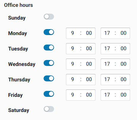
Office hours field
It is often necessary to ask about availability of an agent or company, in terms
of opening times per week day. For this purpose, the office_hours ui:field has
been introduced. For each day, it will render 2 time selectors for the opening
and closing times for that day:
A CMS definition for such an office hours control requires the following schema:
form:
  schema:
    type: array
    title: "Office hours"
    minItems: 7
    maxItems: 7
    items:
      type: array
      minItems: 2
      maxItems: 2
      items:
        type: ["string", "null"]
  ui_schema:
    ui:field: office_hours
Preview button
By using the ui:field: preview_button option in the form's UI
schema, you can create a preview button which runs a part of the bot
script in the context of the current CMS.
form:
  # the JSON schema, describing the form
  schema:
    type: object
    properties:
      preview:
        type: string
  ui_schema:
    preview:
      ui:field: preview_button
This will create a preview button in the form which then emits the
event $studio_content_preview in Bubblescript.
The event has the following items in the event.payload property:
constant- the name of the@constantin the CMSpath- the path to the data in the file (an array)data- the data in the file (only the leaf node on the path).
Example script:
dialog event: "$studio_content_preview" when event.payload.constant == "settings" do
  say "You clicked preview button in the settings CMS section."
  log event.payload.data
end
Expression field type
A field that validates Bubblescript expressions can be defined by using the "format" option of the string type in the JSON schema.
form:
  schema:
    type: object
    properties:
      formula:
        type: string
        format: expression
  ui_schema:
    formula:
      ui:widget: expression
Using format: expression, this field will be validated so that it
needs to be a valid Bubblescript expression.
BML field type
A field that validates BML expressions can be defined by using the "format" option of the string type in the JSON schema.
form:
  schema:
    type: object
    properties:
      formula:
        type: string
        format: BML
  ui_schema:
    formula:
      ui:widget: expression
Using format: BML, this field will be validated so that it needs to
be a valid BML expression. The ui:widget parts renders it as an
expression field (different font).
Re-using UI schemas for similar form fields
Because the schema part of the CMS definition is a standard JSON
Schema, you can extend it and reuse parts of
it
using the $ref! syntax.
For CMS definitions, you can do this for the ui_schema part of the
CMS definitions as well, to allow reuse of UI attributes, by adding a
definitions section to the ui_schema:
form:
  schema:
    type: object
    properties:
      summary: { type: string }
      body: { type: string }
  ui_schema:
    summary:
      $ref: "#/definitions/textfield"
    body:
      $ref: "#/definitions/textfield"
    definitions:
      textfield:
        ui:widget: textarea
        ui:options: { rows: 2, width: "100%" }
CSS classes for formatting collapsible fields
To help marking up collapsible fields there are some CSS classes that can be used:
| CSS | description | example |
|---|---|---|
| comma | Separate elements using a comma | <span class=comma>{{items}}</span> |
| or | Separate elements using 'or' | <span class=or>{{items}}</span> |
| bp3-tag | Display as tags | {{#tags}}<span class='bp3-tag'>{{.}}</span> {{/tags}} |
| bml | Display as BML | <span class=bml>{{matcher}}</span> |
CSV / spreadsheet data
Besides defining forms, there is also a second content management
option, which is used to edit CSV files. By specifying type: table
in the content definition, the content section presents an Excel-like
spreadsheet data:
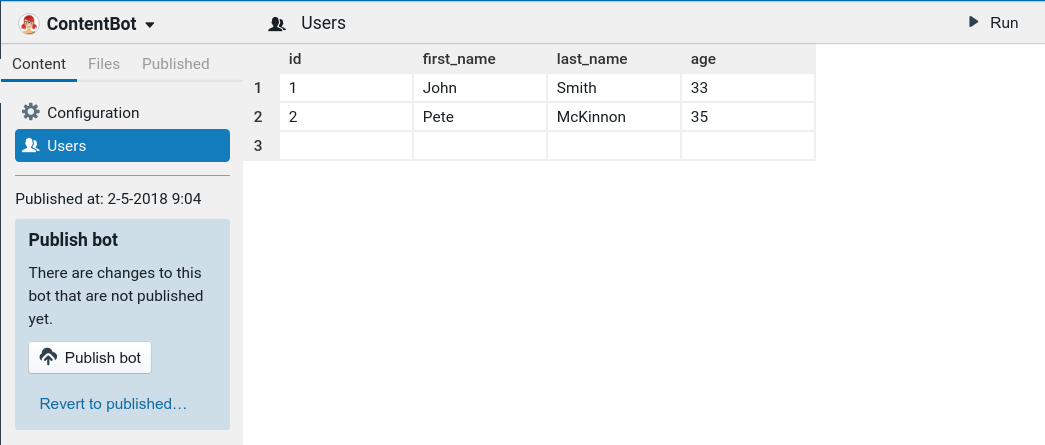
The contents of the spreadsheet is fully editable, and the data itself is stored in a CSV file in your bot's scripts.
The names of the columns are stored in the content definition file, as you don't want content editors to change these names.
The corresponding content definition file looks like this:
type: table
storage:
  type: script
  script_title: users
title: Users
icon: people
table:
  columns:
    - id
    - first_name
    - last_name
    - age
Markdown data
It is also possible to use a markdown editor as a content editor. The following
exposes the readme script in the Content section of the studio, enabling one
to edit it using a richtext editor (Remirror):
type: markdown
storage:
  type: script
  script_title: readme
title: README
icon: paragraph
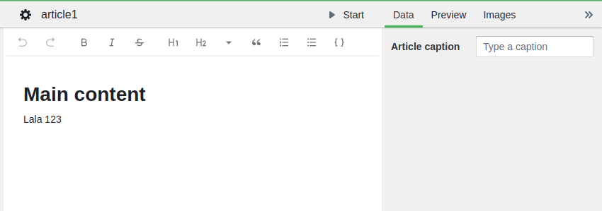
Front matter
Front matter is arbitrary YAML data which is prepended to the markdown file and serves as metadata that can be edited alongside the markdown file itself. In the markdown content definition it is possible to specify a schema and UI schema for this front matter, so that it can be edited alongside the main content:
markdown:
  front_matter:
    schema:
      type: object
      properties:
        summary:
          type: string
          title: Article summary
    ui_schema:
      summary:
        ui:placeholder: "Type a summary"
        ui:widget: autosize_textarea
This will render a sidebar next to the markdown editor which has editable fields for the given schema.
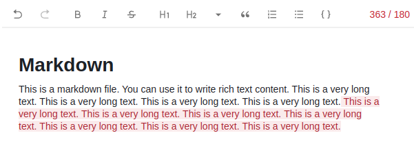
Maximum markdown length
markdown:
  max_length: 500
Limit the markdown content to a maximum number of characters. Visually shows an indicator when the number of characters is exceeded, which looks like this:
GPT buttons in Markdown editor
markdown:
  gpt_buttons:
    - prompt: captionize
      label: "Create caption"
      front_matter_target: "caption"
    - prompt: summarize
      label: "Create summary"
      front_matter_target: "summary"
    - prompt: summarize
      label: "Create summary (inline)"
Adds a button to the Markdown toolbar with a dropdown menu with three options to
use GPT to run the given completion prompt on the markdown content, filling the
given front matter field (from the front_matter_target value).
When front_matter_target is omitted, the generated text is appended to the
Markdown document, and selected.
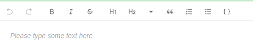
Custom placeholder
markdown:
  placeholder: Please type some text here
Renders a custom placeholder text in the markdown editor:
Automatic intents and training sentences from markdown files
The gpt_intents generator type can be used to create intent files for the QnA
classifier from a collection of markdown articles:
title: "Knowledge base"
type: markdown

storage:
  type: script
  collection: kb/
  collection_editable: true

generators:
  - type: gpt_intents
    gpt_intents:
      provider_agent: my_agent
    script_title: generated/{{ data_script_title }}
This creates yaml files for the my_agent QnA agent. A GPT prompt with the
name gpt_intents must exist and must be instructed to return a JSON string
array:
prompts:
  - id: gpt_intents
    text: |
      system: Generate 10 questions as a JSON string array that a user might have about the following text:
      user: {{ text }}
Folder with content files for a single CMS definition
It is possible to create content definitions for multiple files that share a
single CMS definition. By creating a collection definition, all content files
within a single folder are added as editable CMS items:
storage:
  type: script
  collection: flows/
  collection_editable: true
  collection_max_items: 10
In this case we don't specify script_title for storage, but collection. All
scripts that live in the flows/ folder are now exposed as content-editable
items.
Set collection_editable to true to be able to add and delete these content items.
Set collection_max_items to a number to limit the maximum number of collection
items that can be made.
Expose all data files in a content folder for a single CMS definition
It is possible to create content definitions for multiple files that share a
single CMS definition. By creating a collection definition, all content files
within a single folder are added as editable CMS items:
type: markdown
storage:
  type: script
  collection: kb/
  collection_editable: true
  collection_exposed: true
This creates a folder where you can edit a collection of markdown files. They
are exposed under a single constant named @kb, which is taken from the folder
name.
Each item in the @kb list contains a title (the script title); a data
attribute containing the Markdown front matter, and a body attribute
containing the Markdown text.
collection_exposedalso works for a folder with regular data files; in that case, nobodyattribute is added just,titleanddata.
Multiple content files for a single CMS definition by extension
It is possible to create content definitions for multiple files that share a single CMS definition. By adding an extension to a data script's filename, you can specify a content definition that applies to all data scripts that share this extension:
storage:
  type: script
  script_extension: entry
In this case we don't specify script_title for storage, but
script_extension. All data files that match *.entry will each get
a separate entry in the CMS that applies the given content definition
to that particular file.
Generating Bubblescript from CMS data
It is possible to specify a template in the CMS definition. Whenever the content is edited, the template is run against the data and produces a read-only Bubblescript file:
type: form

storage:
  type: script # stored inside a script file
  script_title: config # Please create a YAML file with this title!

# The generator
generators:
  - type: mustache
    script_title: generated/script
    template: |
      dialog main do
        say "Hello {{ account_name }}!"
      end

title: Account config
icon: cog

form:
  # the JSON schema, describing the form
  schema:
    type: object
    properties:
      account_name:
        type: string
        title: Account name
Whenever the account name in the CMS section is edited, the script
named generated/script is regenerated to reflect the changed data.
Generator type: mustache
Generate Bubblescript based on the given template, using the basic Mustache template engine.
Generator type: liquid
Generate Bubblescript based on the given template, but using the Liquid template engine.
Generator type: flow
This generator takes no options, flow Bubblescript is generated from the input
flow yamls in a hardcoded way, where each flow node generates a bubblescript
dialog. The contents of the bubblescript dialogs can of course be adjusted by
creating the generator_template in each flow type / variant definition.
generators:
  - type: flow
    script_title: generated/{{ data_script_title }}
Generator type: gpt_intents
Generate intent training data for the given markdown content file. Takes as options:
generators:
  - type: gpt_intents
    gpt_intents:
      prompt: gpt_intents
      provider_agent: agent_name