UI elements
The show statement is the generic statement which is designed to
show a variety of media and user interface elements to the user.
In general, there are three kinds of elements that can be shown in the chat: Media, Templates and Forms.
Media elements
Image
To show an image to the user, pass the image URL to show:
show image("https://placekitten.com/408/287")
Additional options:
caption: "text"- a caption to display below the media elementclass: "class"- a HTML class attribute to set on the surrounding elementquick_replies: ["yes", "no"]- a list of quick replies
Supported channels:
- All channels except voice-only channels
quick_replies/classoptions only work on web channels
Audio
To 'show' an audio file, pass an URL to an MP3 file:
show audio("https://example.com/music.mp3")
On the web, this will show a small audio player control; on voice channels like Telephony and Alexa, this will play the audio file directly.
Additional options:
caption: "text"- a caption to display below the media elementclass: "class"- a HTML class attribute to set on the surrounding elementquick_replies: ["yes", "no"]- a list of quick replies
Supported channels:
- All channels except voice-only channels
quick_replies/classoptions only work on web channels
Video
To show a video file using the standard HTML <video> tag, use the
following:
show video("https://example.com/video.mp4")
Additional options:
caption: "text"- a caption to display below the media elementclass: "class"- a HTML class attribute to set on the surrounding elementquick_replies: ["yes", "no"]- a list of quick replies
Supported channels:
- All channels except voice-only channels
quick_replies/classoptions only work on web channelsFor youtube videos, might get better result by embedding a the video in an iframe like this:
show web("https://www.youtube.com/embed/pwmEywQ1QUY")
Embedded web page
To embed a web page in an iframe, use the web() function:
show web("https://www.youtube.com/embed/pwmEywQ1QUY")
By default the iframe's size is 16 by 9, which is the standard movie aspect ratio for video. On click, the same iframe opens in a modal window.
You can also add CSS classes to control the size and behaviour:
show web "https://www.youtube.com/embed/pwmEywQ1QUY", class: "no-modal"
Additional options:
caption: "text"- a caption to display below the media elementclass: "class"- a HTML class attribute to set on the surrounding elementquick_replies: ["yes", "no"]- a list of quick repliespreview_image- see below
Supported channels:
- Only works on web-based channels
For the class option, the following built in CSS class names force certain
behaviour for the embedded iframe:
full- take the full width of the chat window instead of 80%no-modal- do not trigger a modal window when clicking the framesquare- Square frame sizefour-by-three- Size the frame to 4:3 aspect ratiothree-by-two- Size the frame to 3:2 aspect ratiotwo-by-one- Size the frame to 2:1 aspect ratiotwo-by-three- Size the frame to 2:3 aspect ratio (portrait)three-by-four- Size the frame to 3:4 aspect ratio (portrait)fullscreen- Show the modal screen full screen
Combining class names also works, e.g. when you want to show a
portrait image in the chat stream, but full screen when clicking it:
class: "three-by-four fullscreen"
By default the web iframe is very small, as it needs to fit inside the chat stream, and clicking it will make it show a larger modal window with the same URL.
iframe preview image
To show a preview image instead of a small iframe you can use the
preview_image option:
show web "https://www.youtube.com/embed/pwmEywQ1QUY",
  preview_image: "https://example.com/thumbnail.jpg"
This will show the image in the stream, and only shows the iframe when the modal is opened.
Geographical location
Presents a small image of a map to the user, fixed at a certain geo location. Clicking it will open Google Maps.
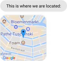
Which is scripted like this:
say "This is where we are located:"
show location [lat: 52.364909, lon: 4.893414]
locations have two extra arguments which control the display of the map image: zoom and maptype:
show location [lat: 52.364909, lon: 4.893414], zoom: 18, maptype: "satellite"
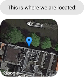
zoom is a number between 1 and 20, the default being 12. maptype
is one of terrain, hybrid, satellite or roadmap (which is the
default).
Contact card
Using show contact(...) it is possible to send a contact card to a
user. Currently this is only supported on the web and on Whatsapp.
dialog contact do

  show(
    contact(%{
      name: %{
        first_name: "John",
        last_name: "Doe",
        formatted_name: "John Doe"
      },
      emails: [
        %{email: "john.doe@example.com"}
      ],
      birthday: "2022-12-31",
      org: %{
        company: "Acme"
      },
      phones: [
        %{phone: "+31612345678"}
      ],
      urls: [
        %{url: "https://example.com"}
      ],
      addresses: [
        %{
          street: "Street",
          city: "City",
          zip: "1234AB",
          country: "Country"
        }
      ]
    })
  )
end
Template elements
Template elements are special elements that are often channel-specific. They are
added to the chat stream using the template() function.
Buttons
The buttons element is modelled after Facebook's Button Template, and supports all of its options. It is mostly used to create a menu, which is presented to let the user select between various options. It looks like this:
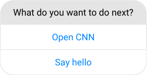
Similar to quick replies you can show a button to the user giving one or more options.
dialog demo do
  # build the buttons
  button1 = [
    title: "Open CNN",
    type: "web_url",
    url: "http://cnn.com"
  ]
  button2 = [
    title: "Say hello",
    type: "event",
    event: "say_hello",
    payload: [message: "Hi"]
  ]
  # present them
  show template("buttons", text: "What do you want to do next?", buttons: [button1, button2])
end
There are two types of buttons that can be used:
Buttons with type: "web_url" create a button that functions as a
basic link: it opens the given URL in the web browser.
Buttons with type: "event" create a button that triggers an
event, which can be caught in your bot later
on.
Supported channels:
- Web; Facebook Messenger
When used on Messenger, the Facebook API dictates that there must be at minium 1 button, and at most 3.
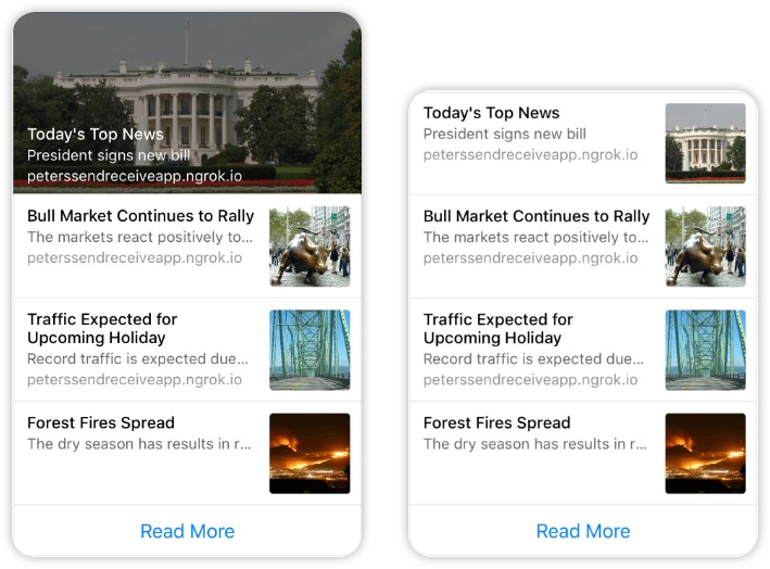
Gallery
The gallery is modelled after Facebook's Generic Template, and supports all of its options. It looks like this:
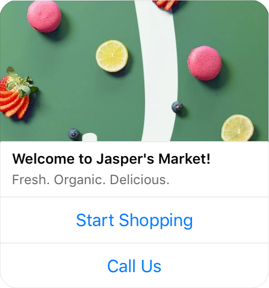
You can show a gallery to the user by using the "gallery" template type and
passing it to the show statement:
dialog demo do
  # build the gallery data
  item = [
    title: "Welcome to Jasper's market",
    subtitle: "Fresh. Organic. Delicious.",
    image_url: "http://via.placeholder.com/350x150",
    default_action: [type: "web_url", url: "http://facebook.com"],
    buttons: [
      [type: "event", event: "start", title: "Start shopping"],
      [type: "event", event: "call", title: "Call us"]
    ]
  ]
  # present the gallery
  show template("gallery", elements: [item])
end
Supported channels:
- Web; Facebook Messenger
Gallery limitations: The Facebook messenger API dictates that there should be at minium 1 item, and at most 10 items. Gallery items can have up to 3 buttons each.
When a gallery is opened in a modal (on web), it is possible to hide the modal when the button is clicked. Pass
hide_modal: trueto the button to achieve this.
On the web it is also possible to disable the popup-modal entirely by adding
modal: false to the card variable:
show template("gallery", elements: [item], modal: false)
Card template
A card template is basically a gallery with just one element. It is only available in its dynamic form:
dialog demo do
  # build the card data
  card = [
    title: "Welcome to Jasper's market",
    subtitle: "Fresh. Organic. Delicious.",
    image_url: "http://via.placeholder.com/350x150",
    buttons: [
      [type: "event", event: "start", title: "Start shopping"],
    ]
  ]
  # present the card
  show template("card", card: card)
end
Supported channels:
- Web
As with the
gallerytemplate, it is also possible (on web) to disable the modal by addingmodal: falseto the card variable.
List template
The list template is modelled after Facebook's List Template, and supports all of its options. It looks like this:
Because lists are almost always constructed from dynamic data, it can
only be modelled in a dynamic way, using the "list" template type:
dialog list_demo do
  # build up the data
  item = [
    title: "Welcome to Jasper's market",
    subtitle: "Fresh. Organic. Delicious.",
    image_url: "http://via.placeholder.com/350x150",
    default_action: [type: "web_url", url: "http://facebook.com"]
  ]
  button = [type: "event", title: "Load more", event: "more"]
  # present the list
  show template("list", elements: [item, item, item], buttons: [button])
end
The above example shows a list with 3 items (3 times the same item, in this case). A list template can have a single button on the bottom, which can be used for pagination or to let the user open a website.
Supported channels:
- Web; Facebook Messenger
List limitations: The Facebook messenger API dictates that there must be at minium 2 list items, and at most 4. Each list item can have only a single button.
Text template
A text template is a templated message that has parameters that need to be filled in when the message is sent to the user. This can be used on Whatsapp to send (paid) template messages outside the 24h messaging window.
Whatsapp usage
The following sends the ticketupdate1 template to the conversation. The
template_id for the whatsapp template must exist and must be approved by
Facebook for this to work. Otherwise, an error message will be logged in the
chat stream.
dialog demo do
  show template("text", template_id: "ticketupdate1")
end
Web usage
A text parameter can be given to specify the text template:
@ticket_ready "Hello {{1}}! Your **ticket {{2}}** is ready."

dialog demo do
  _params = %{"1" => "Piet", "2" => "23432"}
  show template("text", text: @ticket_ready, parameters: _params)
end
Supported channels:
- Web; Whatsapp (360dialog)
Input controls
On web, it is also possible to use any of the Input
Widgets as an argument to show. This way, you
can for example show an inline form in the chat stream without
blocking the user interface:
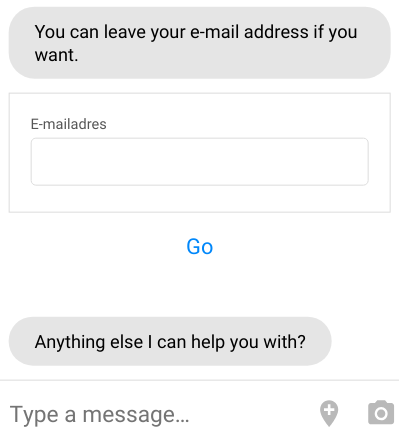
The code for this is show input_method("form", …):
dialog form_demo
  say "You can leave your e-mail address if you want."
  show input_method("form", @address)
end

dialog event: "$form" do
  user.email = event.payload.email
  say "Thanks! I can now reach you on #{user.email}"
end
A submit of this form will cause an event to be fired. This event can be named by defining the property event in the form definition. Otherwise the default event name "$form" is used. Example of a YAML file used for an inline form (form.yaml):
caption: "Feel free to provide your email in case we get disconnected"
height: "compact"
event: "lead_capture"
schema:
  type: "object"
  properties:
    privacy_terms:
      type: boolean
      title: " I agree to the [privacy terms](https://www.botsquad.com/privacy)"
    email_notifications:
      type: boolean
      title: " I agree to receive notification emails"
    email:
      type: string
      format: "email"
      title: "Email"
  required: ["privacy_terms"]
ui_schema:
  email:
    ui:placeholder: "your@email.com"
    ui:autofocus: true
  ui:order: ["privacy_terms", "email_notifications", "email", "*"]
Example of corresponding BubbleScript code:
dialog show_form do
  show input_method("form", @form)
end

dialog event: "lead_capture" do
  user.privacy_terms = event.payload.privacy_terms
  user.email_notifations = event.payload.email_notifications
  user.email = event.payload.email
  remember user
end